When combining colours in the apartment, we must be careful not to exaggerate and not to overload the space with colours and patterns. Continue reading for some tips that will help you choose colours.

1. FAVOURITE COLOUR SHADES
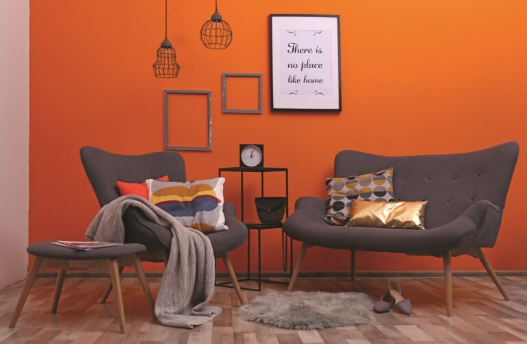
When furnishing the home, we use colour shades that we like and that we choose again and again in everyday life, for instance for clothes, paintings, photos, and the like. If we feel good when surrounded by warm shades in orange or yellow tones, this is definitely the right direction.
2. CONTEXT
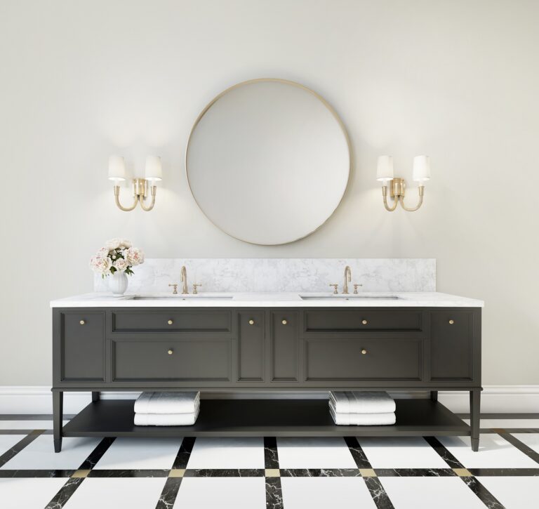
As a guide, use the existing furniture, decorative products, such as paintings, pillows, curtains, and other elements that define the space. Depending on the existing colours in the room, we can decide whether to repaint the room in the same tones or to introduce a contrasting colour combination into the room.
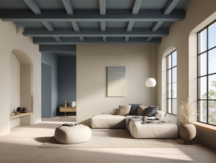
3. SIZE OF THE SPACE
If we paint a small space and we want to visually enlarge it, then choose lighter shades. On the contrary, if we want to create a smaller and more intimate atmosphere, darker colour shades are more suitable.
4. LIGHT
We need to know what kind of light there is in the space that will be repainted. The same colour shade works completely differently in natural light than in artificial light. With yellow light, all shades become warmer, while blue LED light can make a warm shade cooler and bluish. The more natural light there is in the room, the more realistic the shade will be.
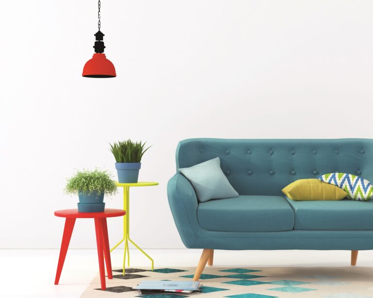
5. THE PSYCHOLOGY OF SHADES
Colours have a strong influence on us. If we want to bring energy and liveliness into the room, then yellow and orange shades are the right choice. But if we want to create a calm and cooler space, then let’s choose from the shades of the blue spectrum of the colour scale.
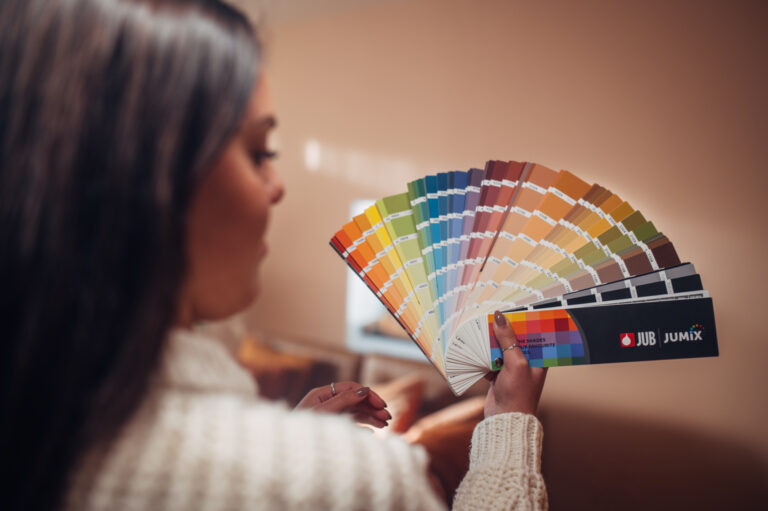
6. TEST SAMPLE
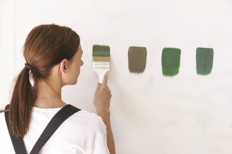
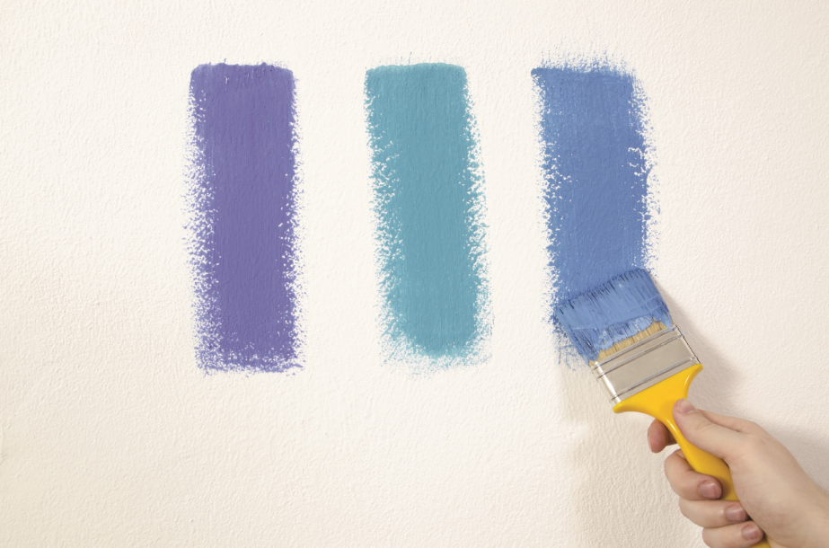
Test paint on a small section of the wall or a sheet of paper and stick it on the wall. This will help us get a feel for whether this is really the right colour shade.
Tip
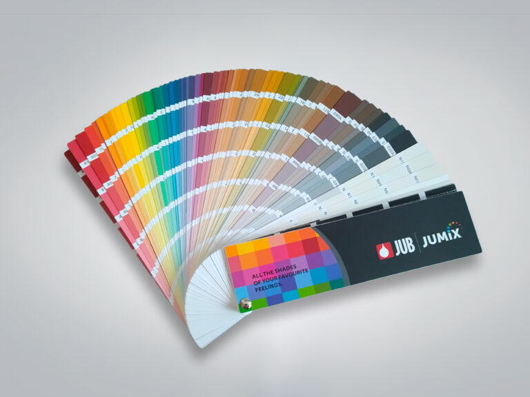
The colour of the background or neighbouring colours also affects the feeling of lightness or darkness of the shade. We must know that no colour appears in isolation, but always in interdependence with another colour, which of course also affects it. Ignoring this fact is the source of many misunderstandings and mistakes that occur when choosing colours or colour combinations in practice. The colour shade of an area of six square centimetres on the white background of a colour chart works differently than on six square meters of a wall in a room.
If you like a certain shade of wall that you see in inspiration photos in various magazines, always check it on the colour chart. The deviation between the printed shade and the actual shade is usually very large.