The Kempinski Palace Hotel in Portorož recently underwent a complete renovation of the interior, and it now invites guests you to the Slovenian coast with an eternal, sophisticated, yet relaxed Mediterranean atmosphere. Tanja Grujičić, co-founder of the interior design studio POKE Designs, guided us through the renovation process.
At POKE Designs, a young but extremely successful interior design studio, they believe in the value of beautiful and functional spaces. They are famous for their individual treatment of each client, which is why it is not unusual that more and more established companies come to them in the search for the idea and implementation of interior design, which bets above all on the exclusive experience of their customers, guests, and users. The studio prides itself on a rich and diverse portfolio, among which, in addition to the Kempinski Palace Portorož hotel, we also find the Pr’ Kopač guest house in Ljubljana, Villa Majda on the Coast and many business premises across Slovenia.
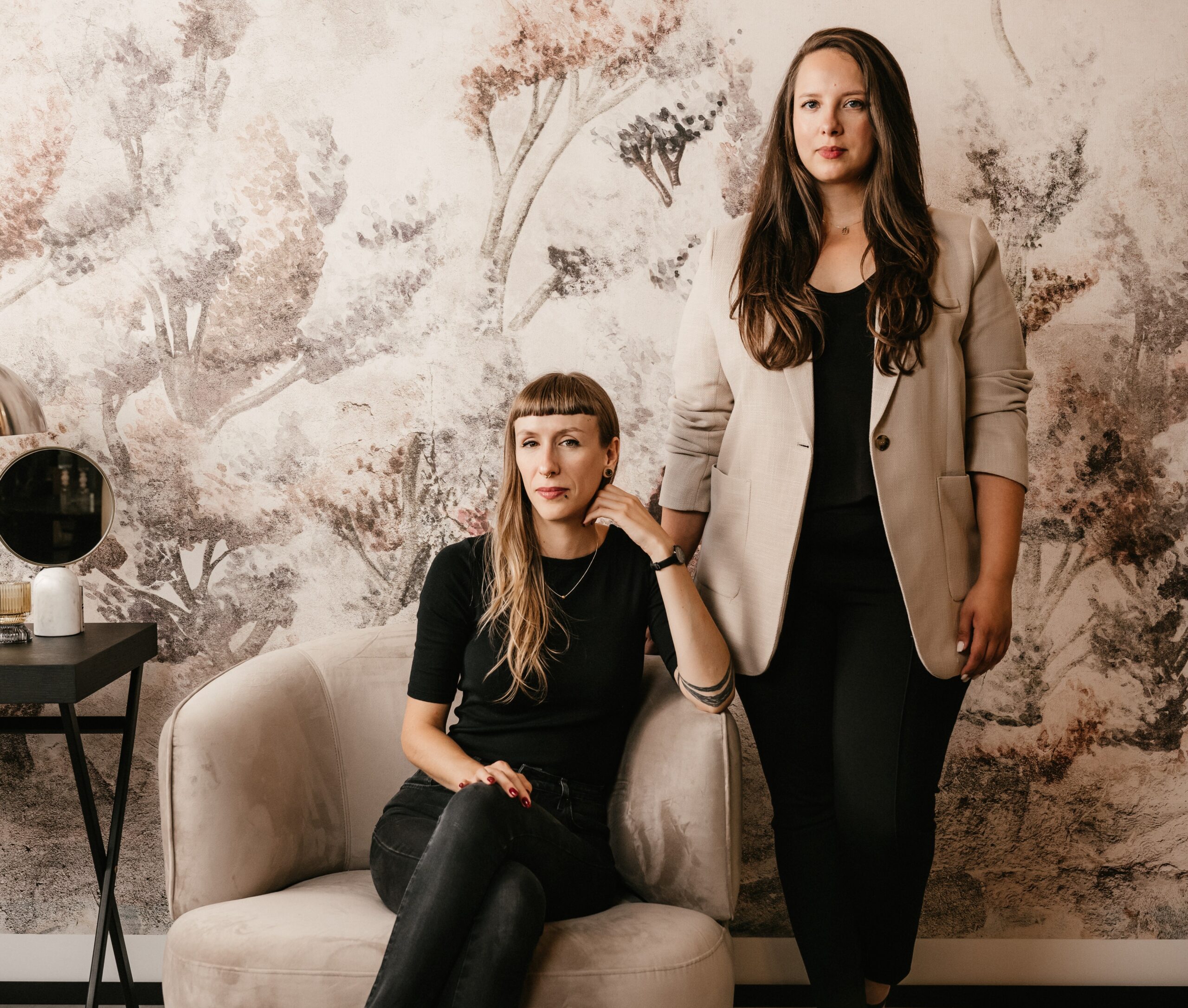
Interiors of single-family houses are also very welcome in the studio. For example, we encountered Tanja at the very moment when she is managing the equipment of a beautiful villa in Koper, which together with the clients they decided to furnish in Californian style. Although it is a very uncommon style in our country, at the studio they were determined and confident in its implementation. And it is precisely this openness in finding the right expression for each client that POKE Designs prioritizes in its way work. “For us, every new project is a blank canvas that deserves a unique and individual treatment,” says Tanja, with whom we talked about the renovation of the famous hotel on the Slovenian riviera, the interior design process and – of course – about favourite colours.
With a 20-percent refresh to a completely new look
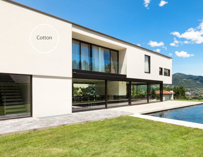
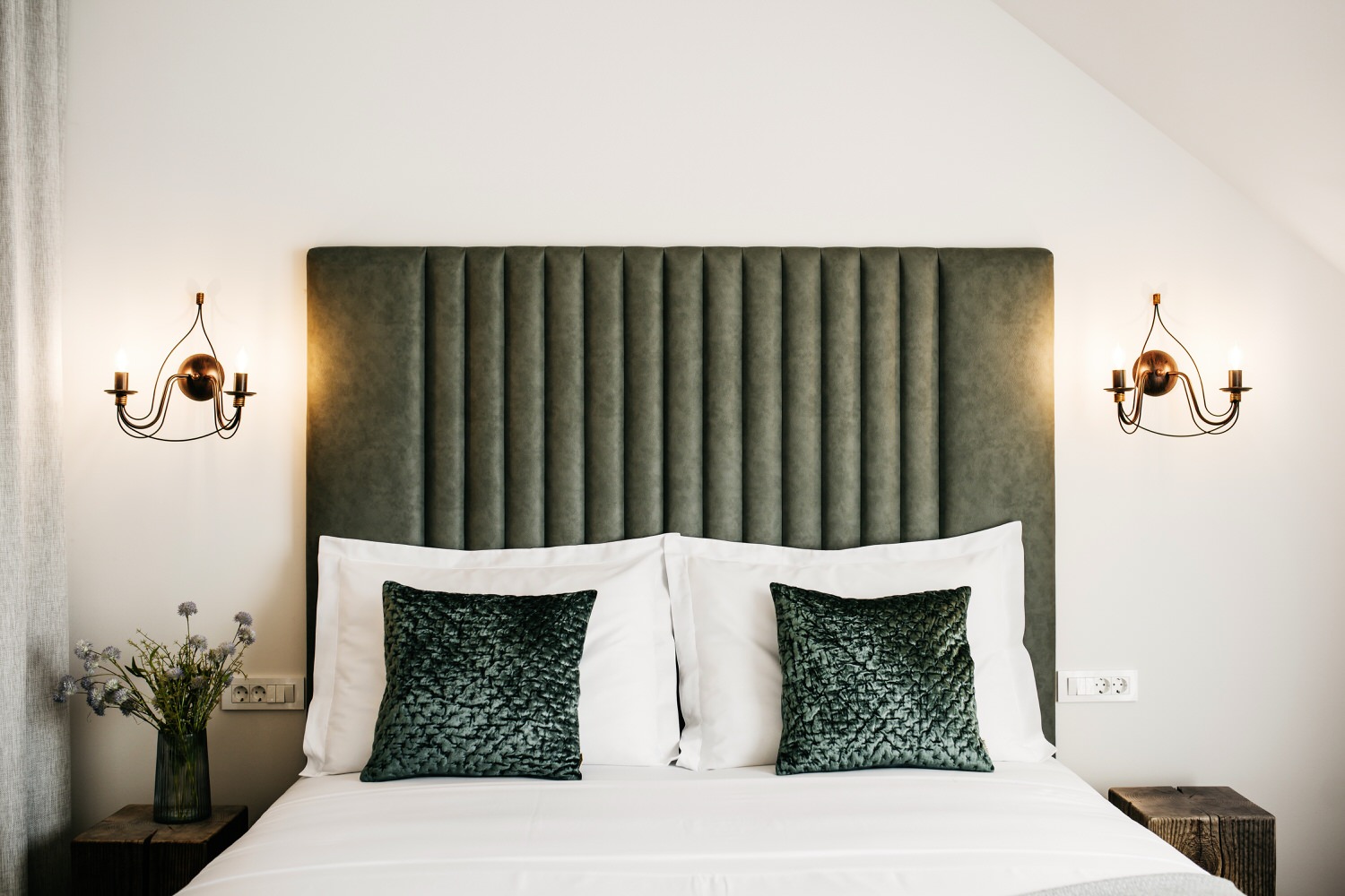
Last year, the management of the Kempinski Palace Hotel in Portorož decided to refresh as much as three thousand square meters of the hotel (78 rooms, four hallways and an entire spa with reception). POKE Designs took over the turnkey implementation. “The project was extensive and ambitious, but we launched it with a clear vision and a firm purpose: to create a space that will offer guests a feeling of freshness, comfort and coziness,” says Tanja, who together with co-founder Petra Božič and colleagues led the renovation from the first ideas to the last detail.
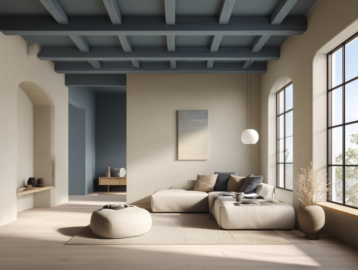
The planning, she says, was quite challenging, as the client wanted to keep eighty percent of the existing fittings – including floors, building furniture and some larger pieces of furniture. “Everything was in strong pink and orange shades, which have faded over the years,” recalls the designer. “And we wanted to create a bright, fresh and relaxing environment. We decided on a gentle colour palette based on off-white shades, complemented by the gentle blue of the calm sea. These colours are not only beautiful to look at, but help to create a feeling of spaciousness and light. With the addition of black details, we added a modern note and elegance to the room.”
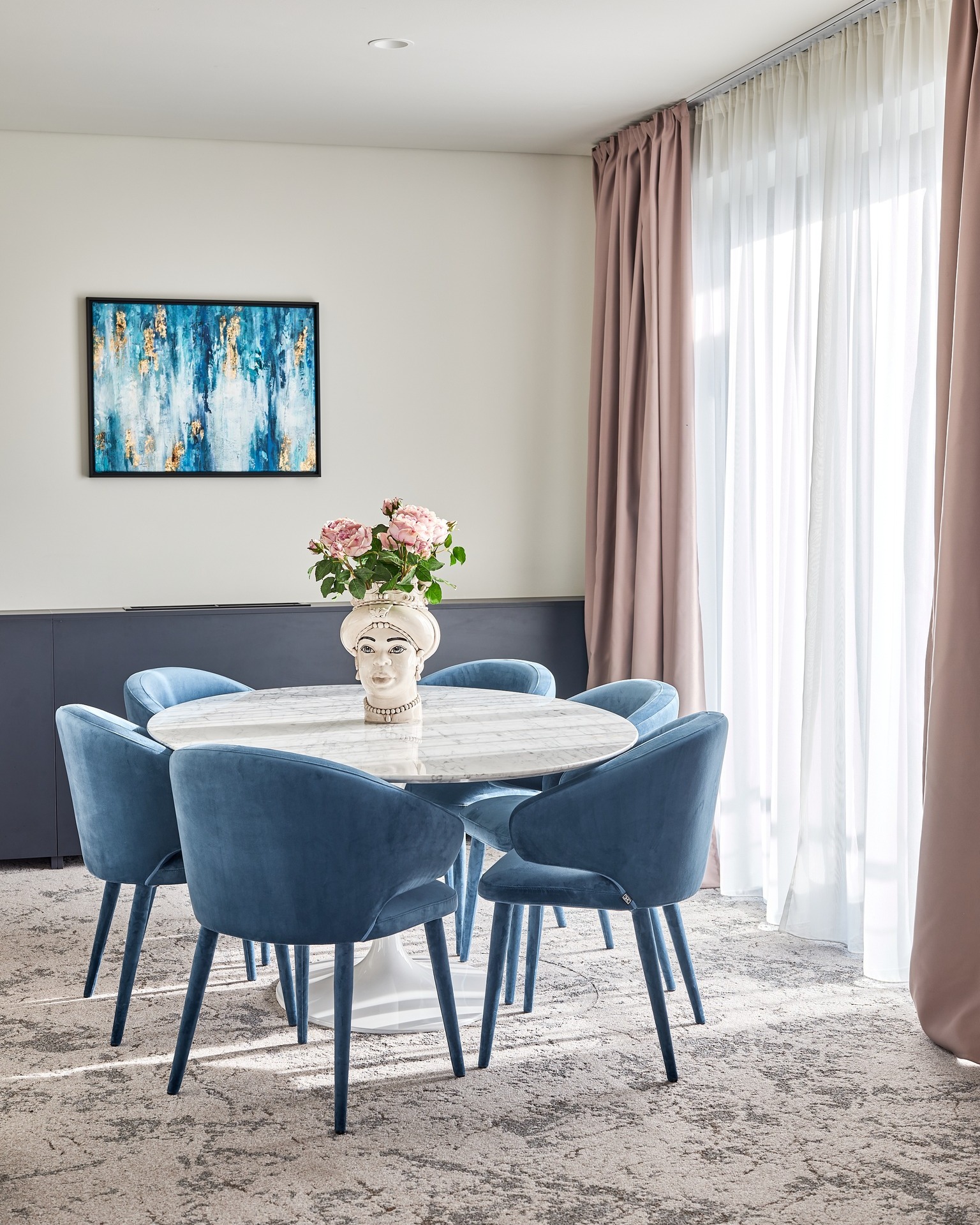
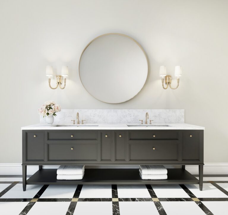
The reception of the hotel’s wellness area was also refreshed with paintings: “The space was previously bright pink, with furniture in vivid colours, but we wanted more refined elegance, eternal design, simple lines… So, we again used an off-white colour scale. This aesthetic is interwoven throughout the entire hotel with the environment of Portorož, which creates a harmonious and relaxed atmosphere.” Only the spa in the basement has a different colour palette – black and gold, which creates a contrast with the bright spaces above the terrain.
Painting the walls: "a small detail that makes a big difference"
So, at POKE Designs they chose the painting of walls as the basic method of refreshing the Kempinski Hotel, and they advise other clients to do so as well. “We always start our cooperation with new clients with a meeting, where we emphasize that it is necessary to make an effort when choosing the parquet and the colour of the walls. We are talking about the largest surfaces in our space – this is the canvas, the foundation for everything else. And to be honest, I can’t remember the last time we used white wall paint in a project. I don’t think that even once in the last six years,” explains Tanja and continues: “I always choose an off-white colour shade for the walls. I think the choice of an off-white colour is not so much related to the style itself, the style of the interior… but it is still an important foundation for everything else that happens. Sometimes, during consultations, we simply advise the client to repaint the entire house. A small detail can make a very big difference. We often tell a customer that this is the cheapest detail that can be changed in the home, because in the final stage, they can do it themselves.”
They faced a similar challenge when expanding the renowned restaurant Pr’ Kovač into a guest house with accommodation: “The client wanted a space that reflected them, very well-known restaurant owners, and given that the facility itself is very special, rural, we chose a combination of rustic and modern design.” They used a lot of solid wood, and in order to avoid the white-wood combination seen many times before, they decided on an off-white shade. We used it for the walls and furniture, and brought modernity into the room with smaller details – custom-made furniture and pre-made equipment.
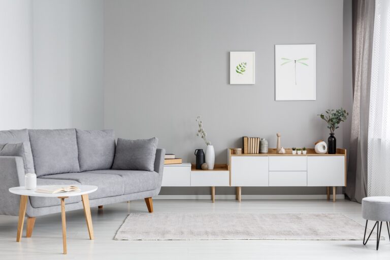
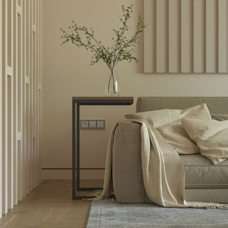
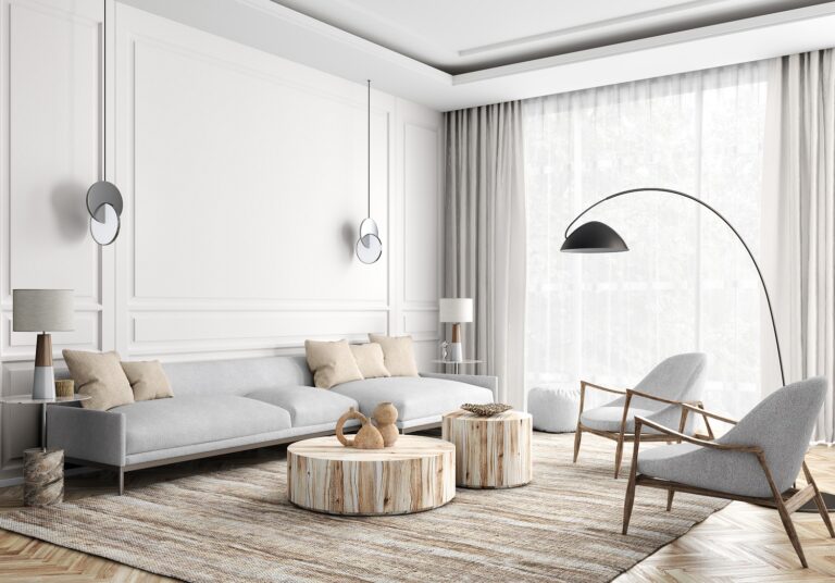
Off-white shades bring warmth, coziness and comfort to the home
We also went through the plans for furnishing the beautiful villa in Koper and through the photos of the renovated house in Ankaran. Off-white colour stands out like a main theme everywhere.
“From the very beginning, our desire was to present people with new materials, a different approach to colours, to explain what the concept of design is, what are styles, and so on,” the interviewer continues, as she flips through their portfolio. “We try to explain to the customer that with an off-white shade, we can highlight other elements, other textures in the room. White can quickly stand out too much. If we have a very nice white door, we can use off-white to create a contrast to this white door so that it stands out more. Or: if we have a typical Scandinavian interior, then with off-white tones we get that hygge, comfort,” she explains. “Off-white colours bring warmth to every home. With the off- white colour, we can create such a feeling of warmth that you can’t even bring into a room with furniture. The first thought when you think of warmth is something that is light, comfortable, and that’s how I imagine these off-white shades.”
The villa in Koper will also follow the off-white colour palette. However, its expression will be completely different from the expression of Pr’ Kopač guest house, Kempinski hotel or villa in Ankaran. Namely, off-white is only the foundation on which different tastes, styles, colours, and expressions can be layered – either countryside, Californian, sophisticated or Mediterranean – and the result suits each individual user of the space.
More: POKE Designs