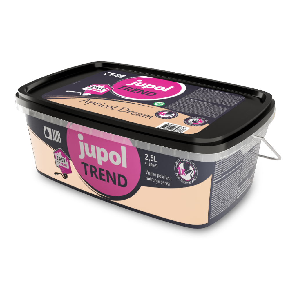
Color of the year 2024
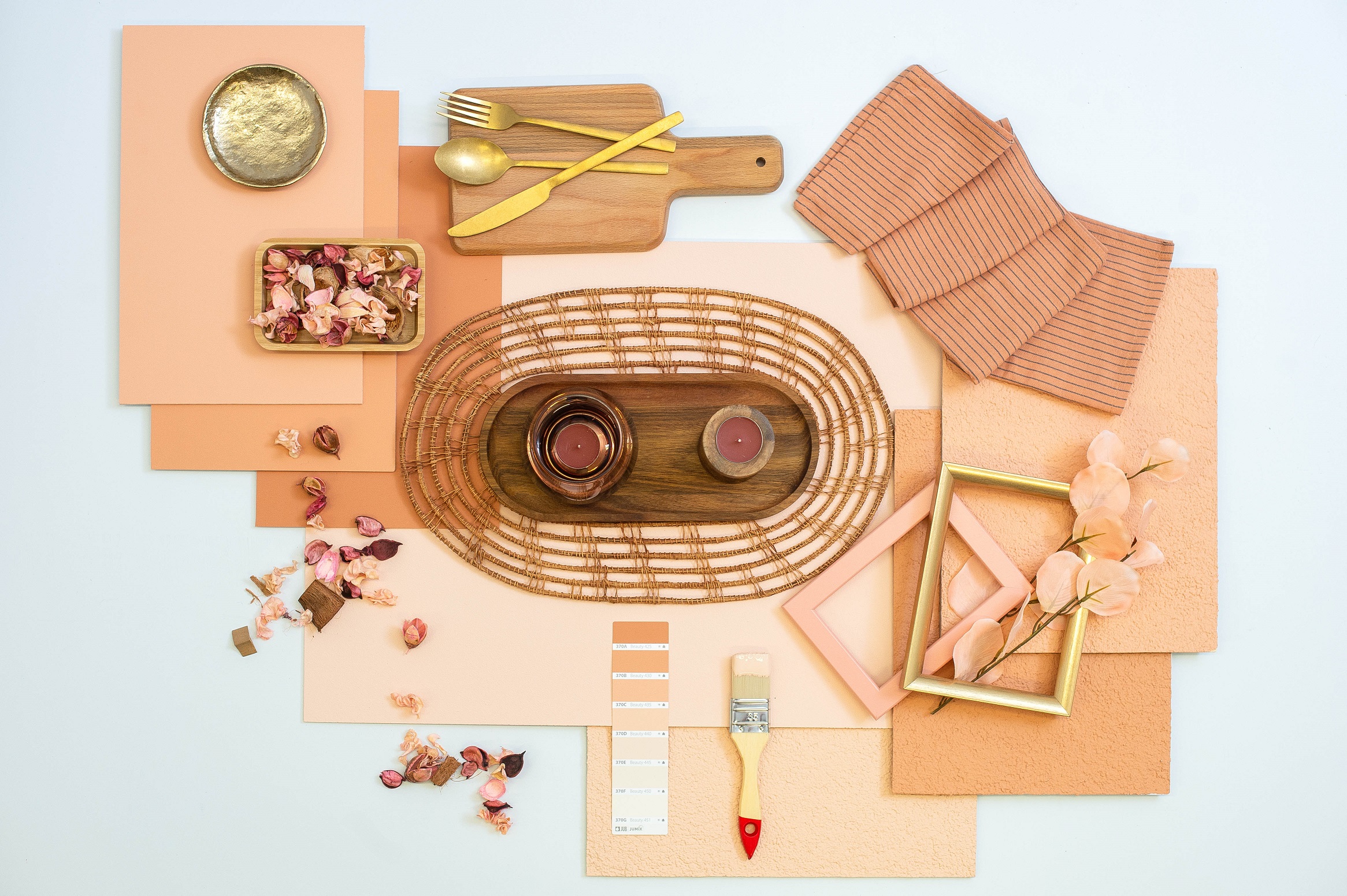
The past is worth remembering after its best moments. They guide us, inspire us, motivate us. To achieve our goals in the future with greater zeal and enthusiasm. At JUB, we were most inspired by Dream Apricot – shade Apricot Dream (or 370 C), which reminds us of the sophistication of interiors in the 90s, when apricot wallpaper, curtains, carpets and just such facades predominated. With the shade 370 C, we remember the past, but we stare at the latest trends that once again put the apricot shade at the very top among colors.
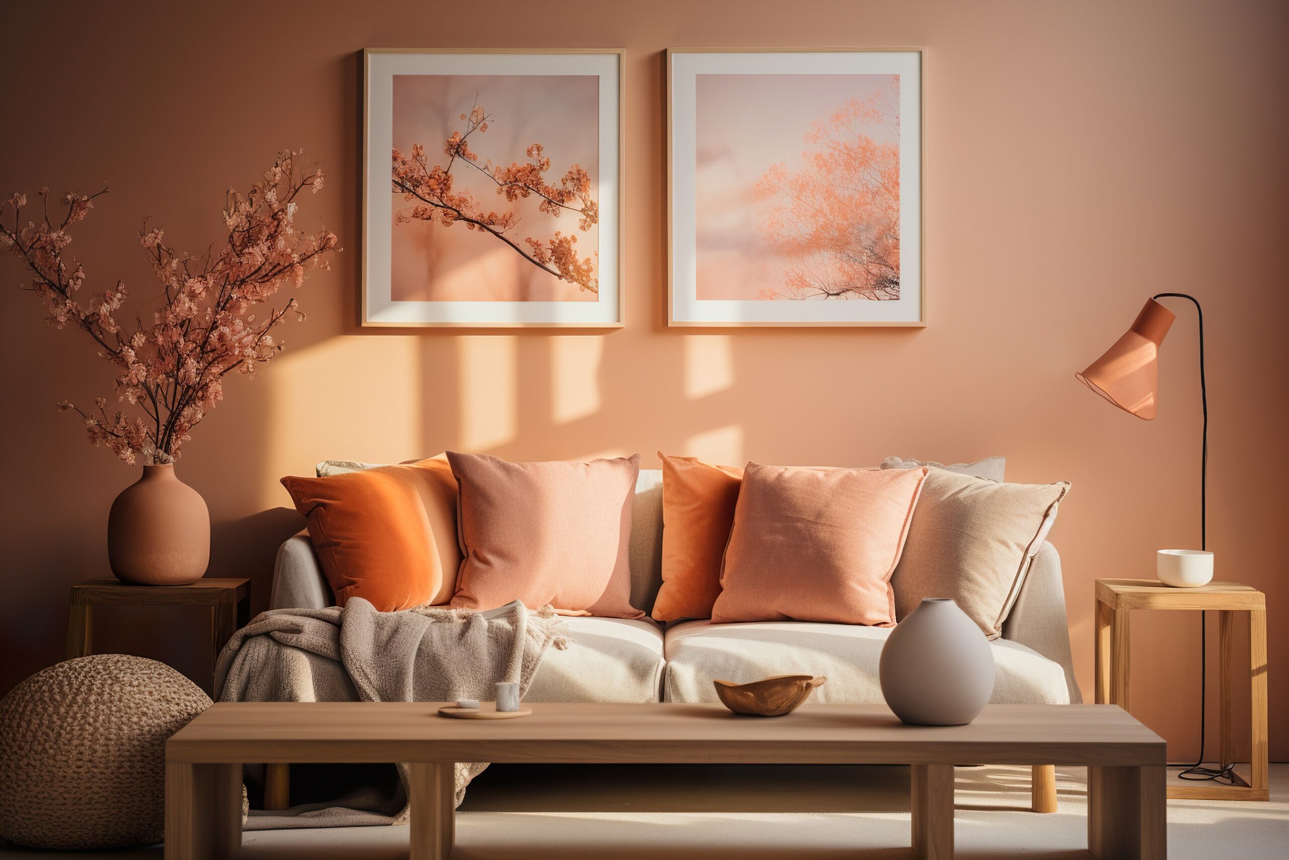
Once upon a time, apricot was extremely popular both in the fashion industry, as well as in the interior and exterior. This is the story of Apricot Dream – Color of the Year 2024. With it, we remember the past when time passed more slowly, we ate homemade and seasonal food, when we hung out with friends, we talked and listened more, when we were more connected to each other, and we had more time for family and friends. We remember a time when we spent less and bought better products. We want to conjure up the atmosphere of a time when life was in many ways “easier” or calmer. And apricot is ideal for that. . .
It is a warm, attractive and soothing color, so we often associate it with peace and harmony. It has a calming effect on body and mind, making it perfect for relaxation and meditation. It symbolizes love, affection and warmth, and with its softness and tenderness it recalls the innocence of a child. It creates positive energy in the room and helps to remove negative feelings. It is ideal for small, dark rooms or rooms facing north, as the pale apricot paint on the wall can revive them and add a touch of sunshine throughout the year.
Freshness, warmth and softness in all its variations
Apricoto shade can be easily combined with many other shades and thus bring different feelings into the space. For example, the combination of apricot with a warm pastel shade or almost white shades creates a soft and soothing environment and is easy for both eyes and work. If you want to incorporate the apricot colour into your existing space, they offer rooms with brown, beige and cream undertones – a good starting point for creating a fresh and timeless ambience.
Contrast, Depth and Homeliness
Apricot dream with black details creates a sharp color contrast. It offers a sliding scale of light and dark, and is especially popular in interiors where Japanese style prevails. Black elements and accessories attract the eyes, while bright apricot-colored surfaces add softness. But to create a contrast in the room, apricot shade can also be combined with blue or green. This combination is ideal for finding the right combination of dark and light and adding depth to the room.
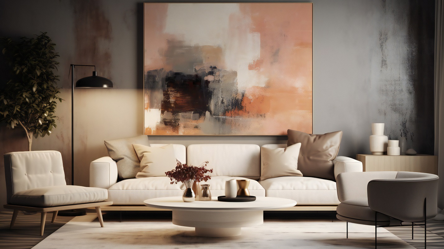
In modern interiors, gray shades are extremely popular, but the gray-white scheme can also work too cold in some places, so (at that time) it needs revitalization. Apricot dream is an ideal combination with different shades of grey, as it warms and softens the monotonous space, while at the same time giving it a sense of home.
So, if we summarize… The apricot color is versatile. With its gentle metaphor, it softens even the roughest, sharp lines and creates a stamp. Strong enough to write history and dictate nostalgia. With her, we will remember all the good things the past has left us. On the one hand, we will use it to create new stories and preserve old artworks in their more modern versions.
Don't miss out!
Color of the year in JUPOL Trend. Ready to use in Apricot Dream.
More about interior paint JUPOL Trend