Interview with interior designer and stylist Alenka Dirnbek, who runs her own interior design studio in Australia
Abroad, off-white colour shades have almost completely replaced the neutral white colour. We talked about their use with Slovenian stylist and interior designer Alenka Dirnbek, who lives and works in Australia.
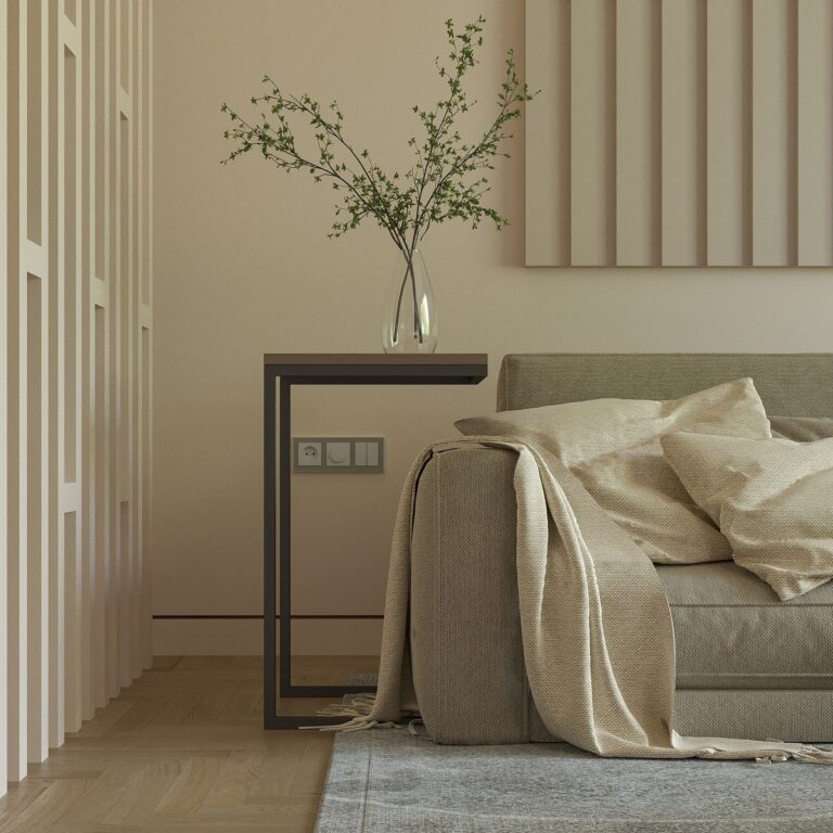
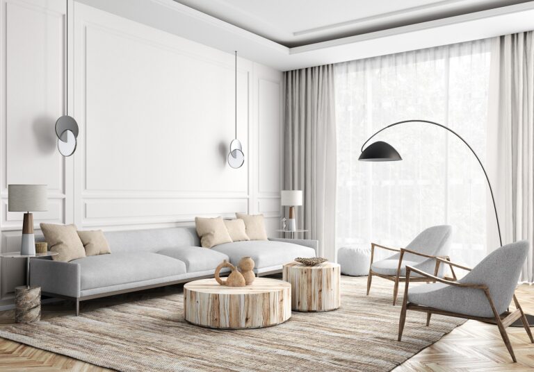
photos: Alenka Interiors archive
Alenka moved to Australia in 2005, where she first founded her own cosmetics brand, sold it in 2015, and four years later opened her own interior design company, Alenka Interiors. An exceptional sense for combining materials and colours, the creation of attractive and functional compositions and her love for natural materials have contributed to the fact that in a relatively short time she has created a diverse portfolio of realized projects that excite both Australians and Slovenians. She shared with us some good practices in home furnishing and the use of colours, which, as she says, “open up the space, make it airy, and thereby affect our mood and well-being in the room.”

Alenka, how long have you been working as an interior designer and stylist in Australia?
Despite the fact that I completed my interior decorator course years ago, I started my career as an interior stylist or designer in Australia relatively recently.
By renovating my own real estate, I gained experience that led me to a new professional challenge. In 2019, I opened my own studio, Alenka Interiors, where I focus on advising during renovations, choosing materials, colours, layout and decorating rooms. Before that, I worked as a stylist and consultant for a luxury furniture company, which gave me an excellent background for working in interior design. I enjoy working on projects of all sizes and am I constantly learning and developing my skills.
How do the wishes of clients in Australia and here differ? Do they have a different way of living, a different style?
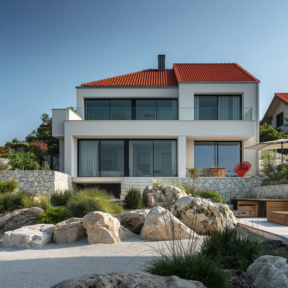
Based on my experience in interior design, I can say that the wishes of clients in Australia and Slovenia can be quite different. Due to different cultural influences, there are also many more styles and approaches in interior design in Australia than in Slovenia. Here, on the Gold Coast in Queensland, the emphasis is on coastal style, whether it’s Coastal Hampton, Coastal Farmhouse, Coastal Scandinavian, Coastal Mediterranean and the like. People like spaces that are bright and open, with large terraces that connect to the outdoors and offer views of the water, be it a canal or the ocean.
The architecture of the houses is adapted to the location. Houses near the coast are usually very bright both inside and out, while houses near forests can boast darker facades. In general, we can say that the wishes and tastes of clients in Australia are more diverse and depend on the location, while traditional and minimalist style prevail in Slovenia.
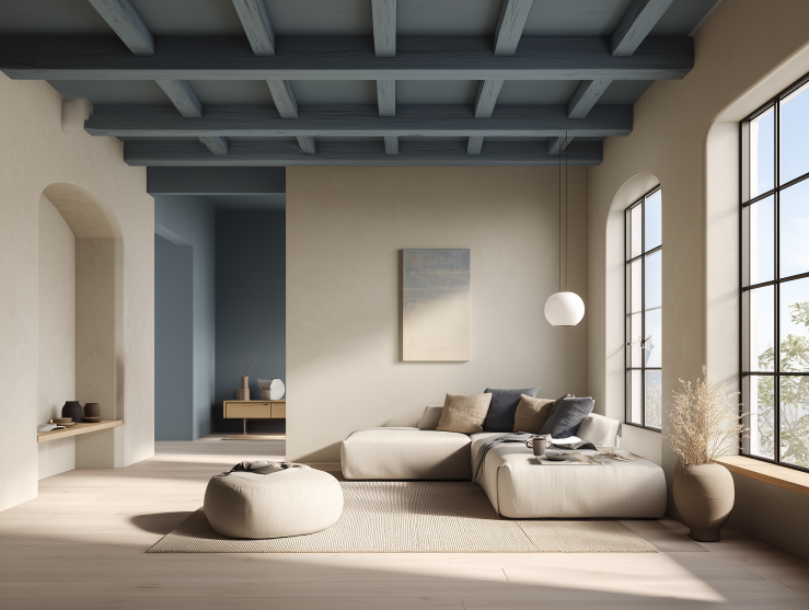
Surely this interweaving of cultural influences also contributes to the luxury of the interior. In your projects, for example, we see a very diverse range of materials and colours (from stone to copper, natural ceramics, and leather to wood; from sage green to terracotta shades), which nevertheless creates warm, cozy and relaxed ambiances. Which elements and colours, in your opinion, give home the greatest character?
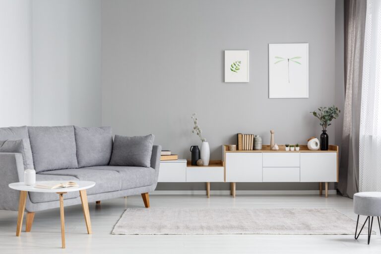
The combination of different elements, such as textures, furniture profiles, carpets, curtains, lights, decorative products and colours give the room a pleasant feeling of home. Personally, I like to use contrasts such as black and white, but also calm colours such as sage green, terracotta and natural beige shades, which I introduce through accessories: decorative pillows, vases, artwork and rugs. Minimalist decoration that does not overload the space is often the most pleasant one.
I like to add texture to an accent wall, for example in the form of decorative wooden panels, which can be in shades of white or light green, but shades of sage, duck egg and French blue are also popular – depending on the style of the house and the overall equiipment.
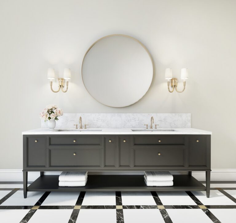
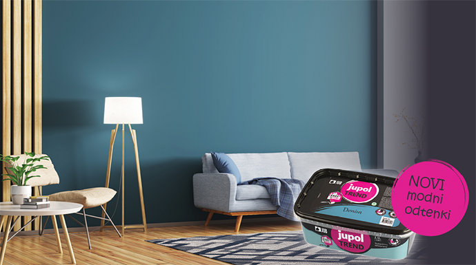
For accent walls, you probably leave the selection of colour to the customer. What do you advise when choosing the colour of the remaining walls? Classic white still dominates as the basic and most frequently chosen colour in Slovenia…
Here, there are many shades of off-white colour available on the market, which differ from each other in undertones, for instance some are more yellowish, others more greyish or bluish. Choosing the right shade of white can become a challenge, so people often listen to the advice of designers or painters.
When choosing white for walls, I advise clients to consider other elements in the room as well, such as the floors, furniture, lighting and decor. The same shade of white can look different in different circumstances, so it is important to choose the shade of white that fits the overall furnishings of the room.
The wall colour is a very important factor that affects the overall image of the room: it can add warmth, create the illusion of a larger or smaller space, emphasize architectural features, etc. That’s why I pay a lot of attention to it when planning interior design.
So, classic white is hardly used in Australia? But what are the advantages of using off-white shades compared to classic white?
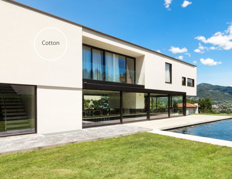
That’s right, the classic light white colour is mainly used here as a base coat or for ceilings, while off-white shades offer more options when choosing a colour for walls. Using an off-white shade instead of classic white has many advantages. For example, different shades of off-white colour give the room a different depth, which allows the walls to not look too bright and dead, but to get warmer or cooler tones. This adds a special charm and style to the room.
Your interiors are very airy and light. With which off-white undertone can we achieve such an effect?
To achieve an airy and light effect in the room, it is recommended to choose an off-white shade with a neutral undertone. However, one must be careful that there are not too many warm elements in the room, as in such a case natural white can appear slightly creamy or yellowish. In such cases, it is recommended to choose a shade with a slightly cooler undertone, which can be used to achieve a nice neutral tone of white. Regardless of the selected off-white shade, the colour always has depth, it is not too white or too light, and it also has a special feeling of density.
It is important to try several different shades on the wall and observe them in different lighting conditions, so we can choose the one that best suits our space.
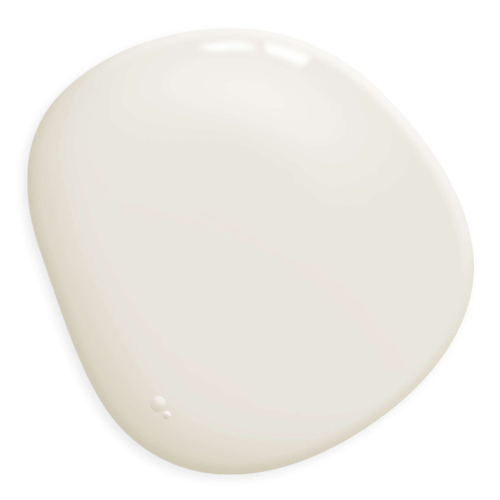
But what is your favourite off-white colour that you turn to again and again?
Among the many shades of white, there are some that I often use when designing interiors. The first shade is Snowy Mountains, which I usually use at half strength and it has a slightly cool undertone. The second is Natural White, which I use full strength and it has a neutral warm undertone, and the third is Popcorn White, which has extraordinary depth and gives a soft warm feeling. When choosing among them, I decide based on the space, its brightness and the overall interior design style. All three shades look very neutral, and they have in common that they add freshness and warmth to the space, while at the same time creating the impression of a modernized home.