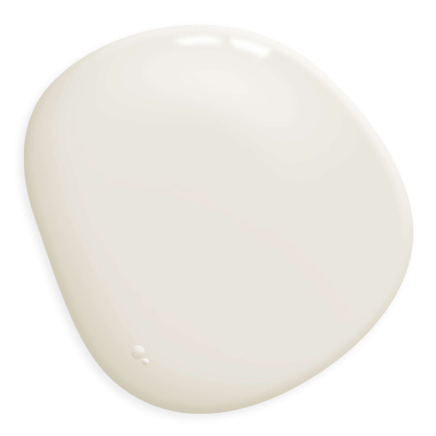
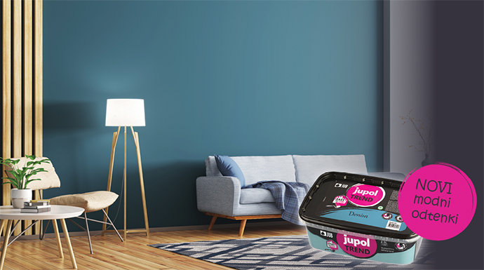
Off-white colour shades are already well recognized abroad since decades ago the classic white wall paint gave way to colours such as ivory, icy or creamy white, and to the colours of eggshell, ricotta and mascarpone, which bring subtle warmth and eternal elegance into the ambiance. However, they are now also available here, as they are mixed for you at all JUMIX mixing centres, and they are available in interior paints of a higher price segment, which also includes JUPOL Gold. (link to Gold)
We divided the off-white colour shades into various groups: warmer (cotton, alabaster, jasmine), cooler (icy, the colour of salt or kefir), neutral (lace, pearl, tofu) and pink (ricotta, powder, basmati). These are gentle shades of white, but they have many advantages over their non-pigmented sister.
How to choose the right shade?
Since off-white shades are neutral while at the same time they adapt to the room like real chameleons, there are not many rules when choosing. They go into all rooms, complement all styles of equipment, and are combined with all the colours that already exist in the room. Nevertheless, here are some advice on choosing an undertone. You can choose it according to several factors – the orientation of the room, the existing architectural elements, or the effect you want to achieve.
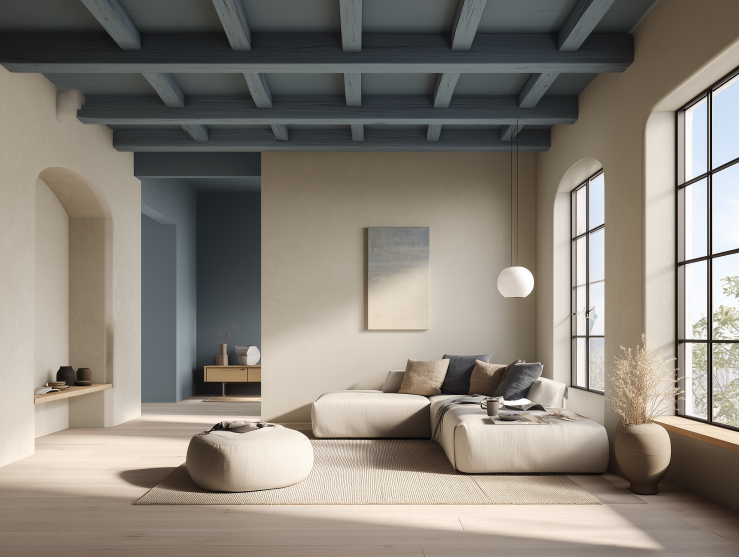
Orientation of the room - balance the colour of the sunlight
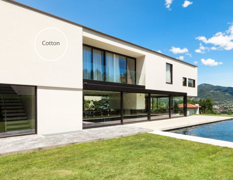
Rooms with a south and west orientation, dominated by strong and warm light, will appear more elegant in off-white with cool undertones (Ice cube, Kefir, Frost, Salt), as they will balance the warm colours of sunlight. On the contrary, it is better to paint rooms with less natural light with an interior paint with a warm undertone (Cotton, Alabaster, Jasmine, Eggwhite).
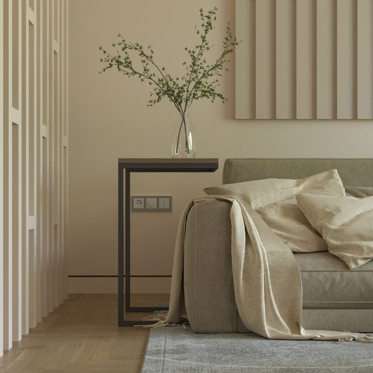
Neutral colours (Lace, Pearl, Tofu and Dust) will fit nicely into all ambiances, while colours from the Blush spectrum (Ricotta, Marshmallow, Baby powder and Basmati) will bring warmth where you need it − in the living room, dining room, bedroom, or children’s room.
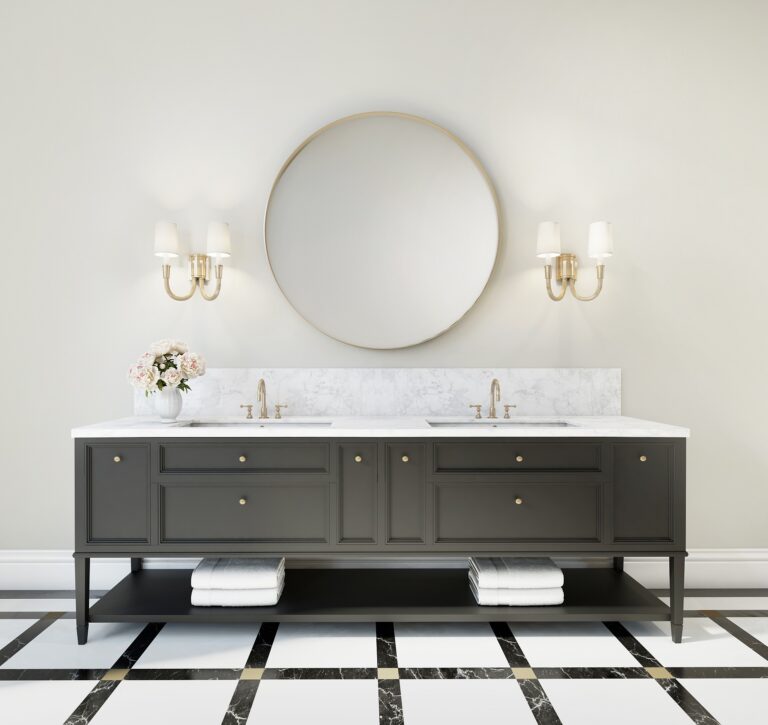
Complement or highlight architectural elements
When choosing a colour for your home, also keep in mind the colour of the floor and ceiling, building furniture and built-in furniture and wall decoration (stucco, wallpaper, batten). If you would like to emphasize the aforementioned architectural elements, choose a contrasting tone. However, if you want to hide them as much as possible and blend in with the whole, paint the walls next to them with a similar shade.
What kind of ambiance would you like to create?
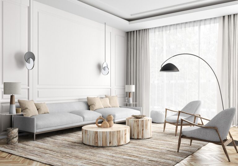
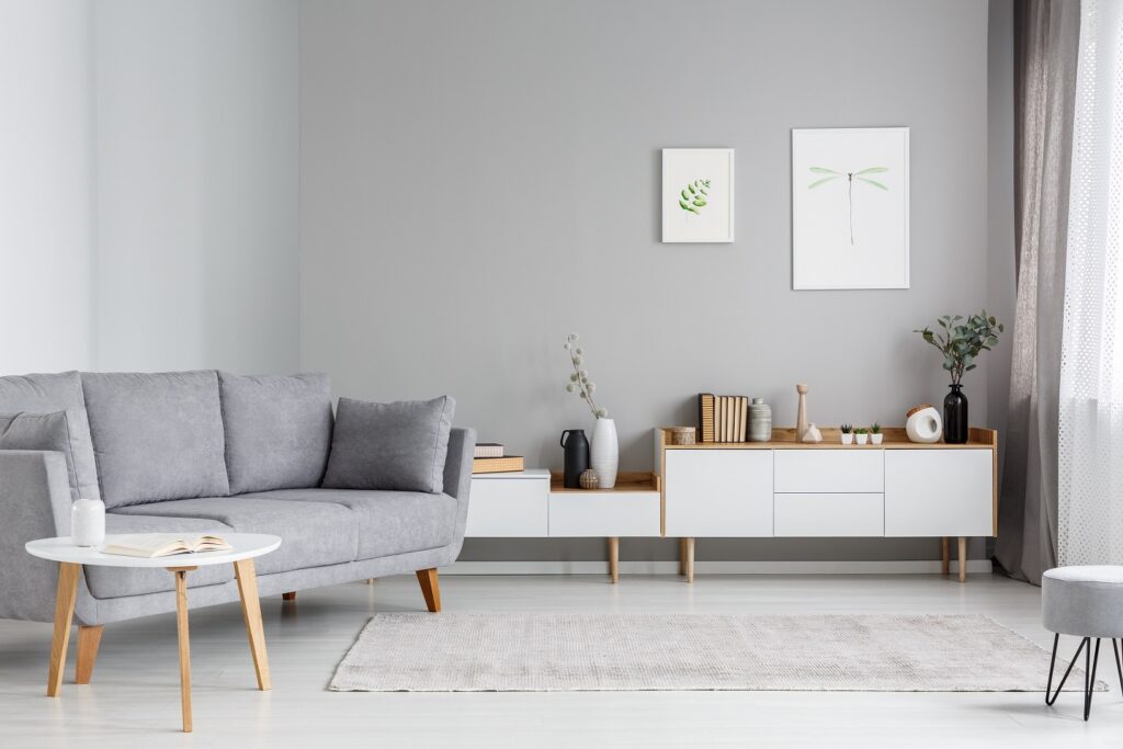
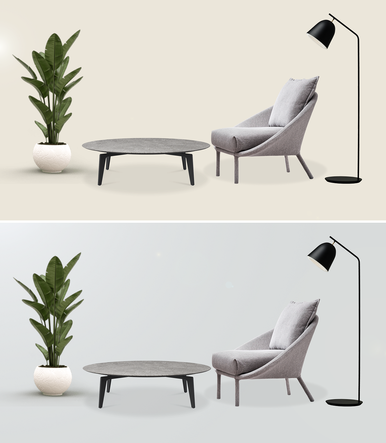
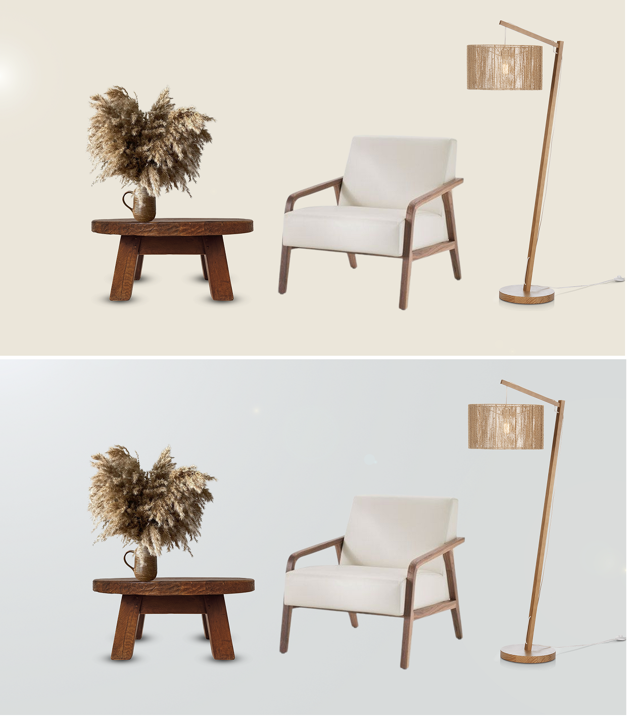
The most important question is, of course, what kind of atmosphere you would like to create. In the example below, we prepared four different ambiances with a combination of two sets of furniture and two off-white shades (Frost and Mascarpone).
In two cases, the wall paint completes the selected furniture, and in two cases, it complements it with a similar tone. You can do the same: older furniture will look fresher if you balance it with a complementary colour (opposite one on the colour wheel); modern ambiances that rely on a sophisticated monochromatic palette will shine even more if you complement them with a similar wall tone.
Final tip
By choosing off-white shades of wall paint, you will bring additional softness and depth to the room, emphasize architectural elements, or balance the style of the equipment. When choosing an undertone, let yourself be guided primarily by your taste, and if you are in doubt, ask an expert at JUB’s JUMIX tinting stations for advice.