Let’s enrich our living spaces
The rooms we live in can be enriched with colours, aesthetically arranged and adjusted according to our own preferences.
However, it is good to know something about colours so that we do not spoil the ambiance in which we live. The experience of colours depends on several factors: the colour shade, the size of painted surface, the type of light and our general well-being.
Colour shade
Colors affect the way our mind works and our emotions. Let’s focus on colors that bring us beneficial influences.
| WHITE | Background colour, creates a feeling of coolness and openness. |
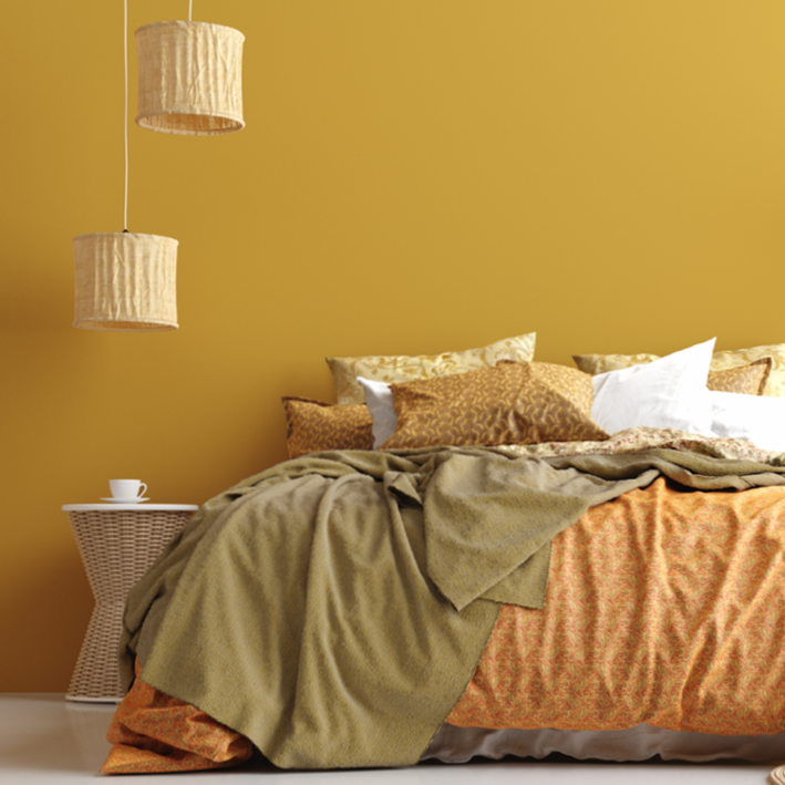
| YELLOW | Works best in kitchens with dining rooms, living rooms, work (study) rooms and recreation areas. It is not suitable for bedrooms; it cheers up, brightens and adds warmth to the room. |
| ORANGE | Same as yellow, except that it is not suitable for study rooms and offices and bedrooms; it gives a feeling of support, friendship, strengthens self-esteem and stimulates the appetite. |
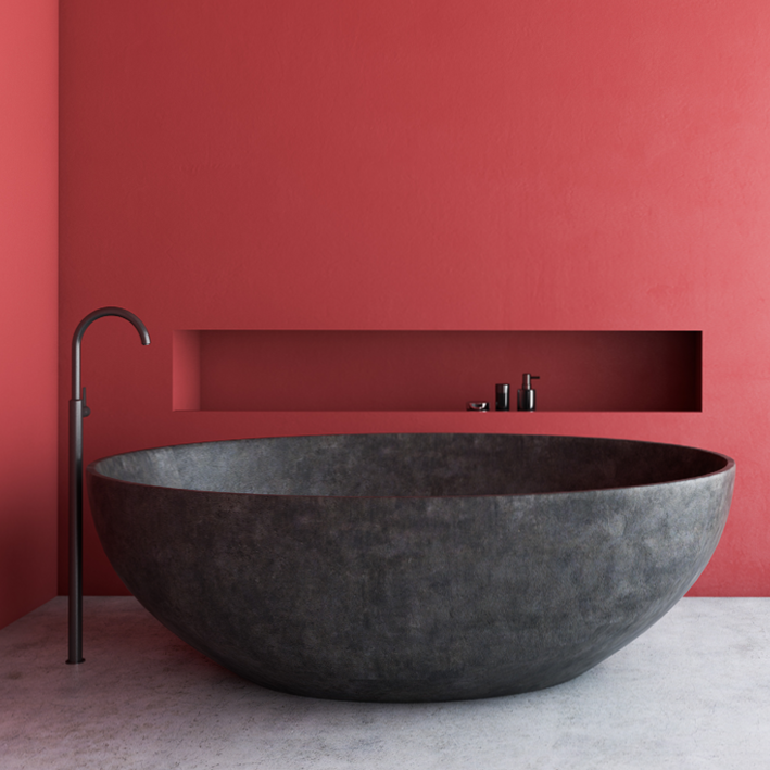
| RED | Best suited for dining rooms, as it promotes vivacity and sociability and increases the desire for food, it is also often used in restaurants, children’s playrooms, gyms, etc. It simply cheers up, enriches the space, but seemingly reduces it. It is not suitable for bedrooms, study rooms, workshops, school classrooms, offices, waiting rooms in hospitals, etc. |
| PURPLE | The purple colour is suitable for bedrooms, bathrooms and spaces where we relax and meditate. It should be used for accessories and smaller surfaces, as it brings calmness and mental balance. |
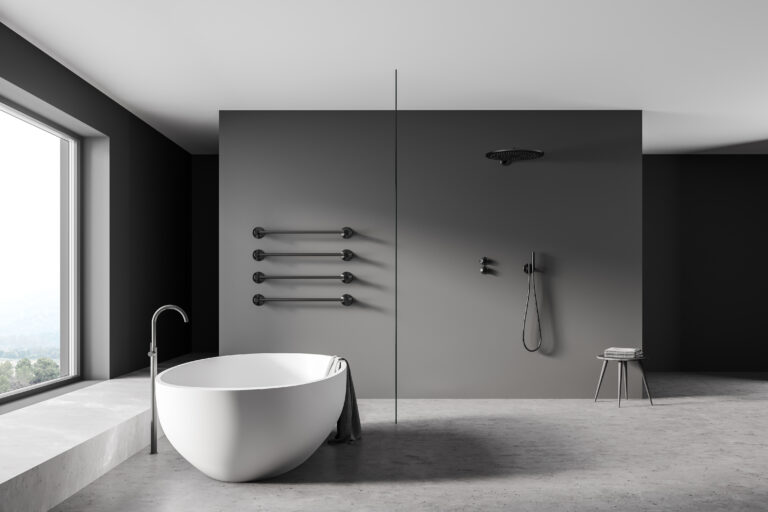
| GREEN | Most suitable for living rooms and bedrooms, workspaces where nervousness and stress are a daily phenomenon, where tension is present, as it calms and cools. Not suitable in gyms and cold rooms. |
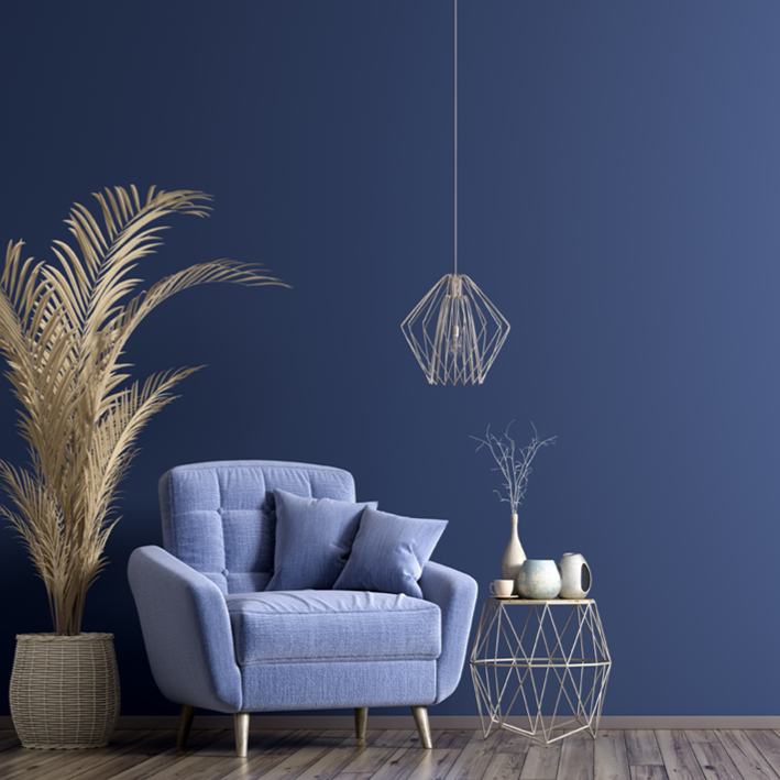
| BLUE | Suitable for bedrooms, bathrooms, even workspaces, especially for spaces intended for relaxation. It creates a cool and airy space. It is not suitable for dining rooms, areas for entertainment, recreation, basements. |
SURFACE SIZE
If we are choosing a colour shade based on small sheets from the colour chart, the colour looks pleasant and pleasing to us on the small sheet. But when we paint a wall, living room or maybe a facade with this colour, we can perceive this shade differently.
If we choose an intense/saturated shade, it will appear even more intense on a larger surface. If we choose a very light shade, it will appear even brighter on a larger surface. Therefore, it is recommended to check the colour shades before painting on a larger surface (at least 15×15 cm, maybe more).
TYPE OF LIGHT
It is necessary to take into account that the light itself also has a great influence on the colour. By wise use of colours and light, we can illuminate all dark areas in the apartment.
In a room with good natural or artificial lighting, we can also afford to choose more lively or dark colour tones. Even in a small space with good natural lighting, we can confidently afford to combine darker or vivid colour shades, as the room will not feel close due to the abundance of light.
FEELING
Colours have power because they affect our mood. In this context, an individual’s personal attitude to colours depends on many factors, such as their character, age, gender, mood, fashion, etc.
Our current mood plays an important role in choosing a colour, so it is wise to choose a shade when we are calm and in a good mood. It is by no means a good idea to choose a colour during a full moon or on a day when we are tired, nervous or stressed, because we perceive colours differently on such days.
Colours are one of the most important building blocks of design, both in architecture and interior design, and they have a great influence on people. Both the rules of art theory and the personal experience of each individual user lead to the selection of perfect colour shades.
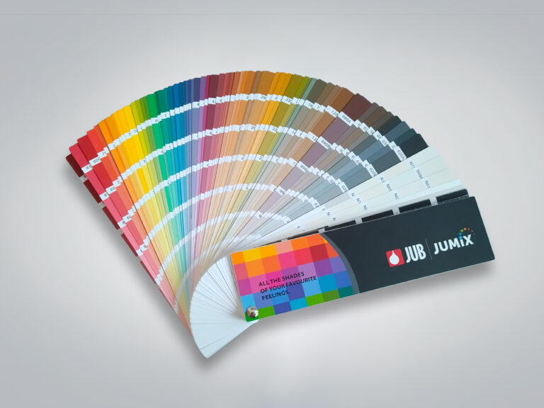
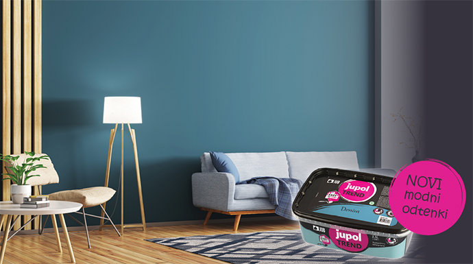
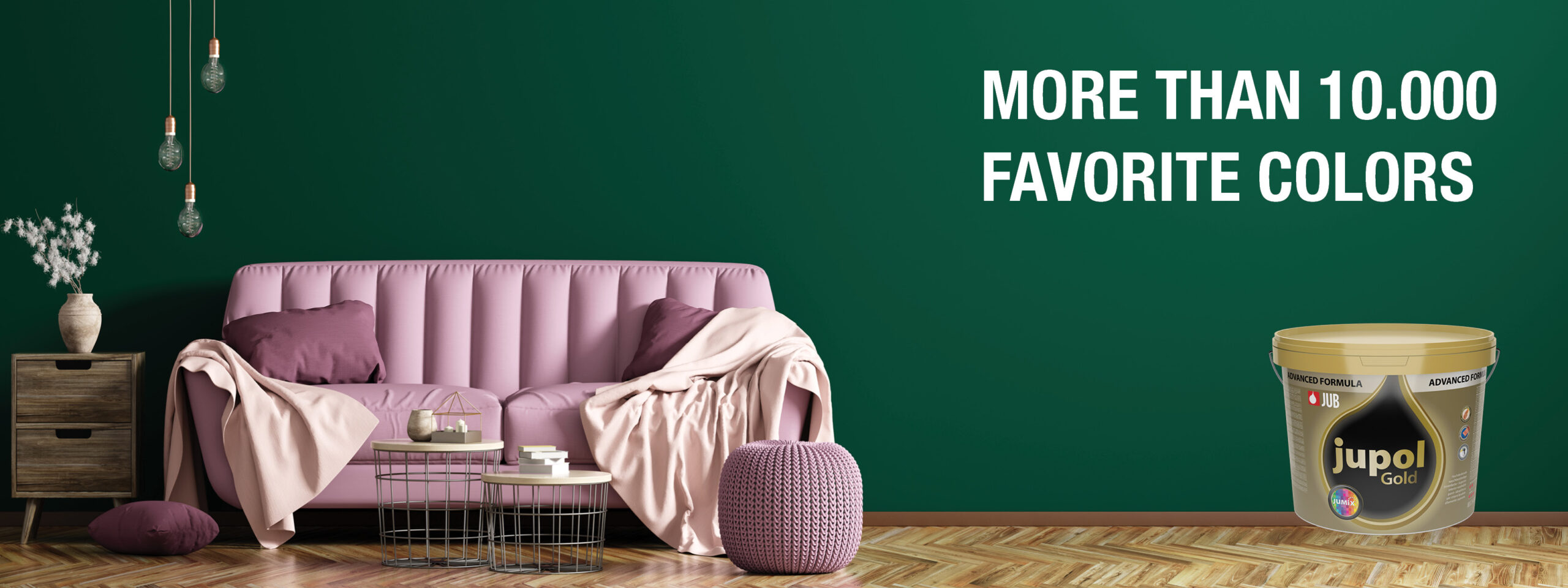
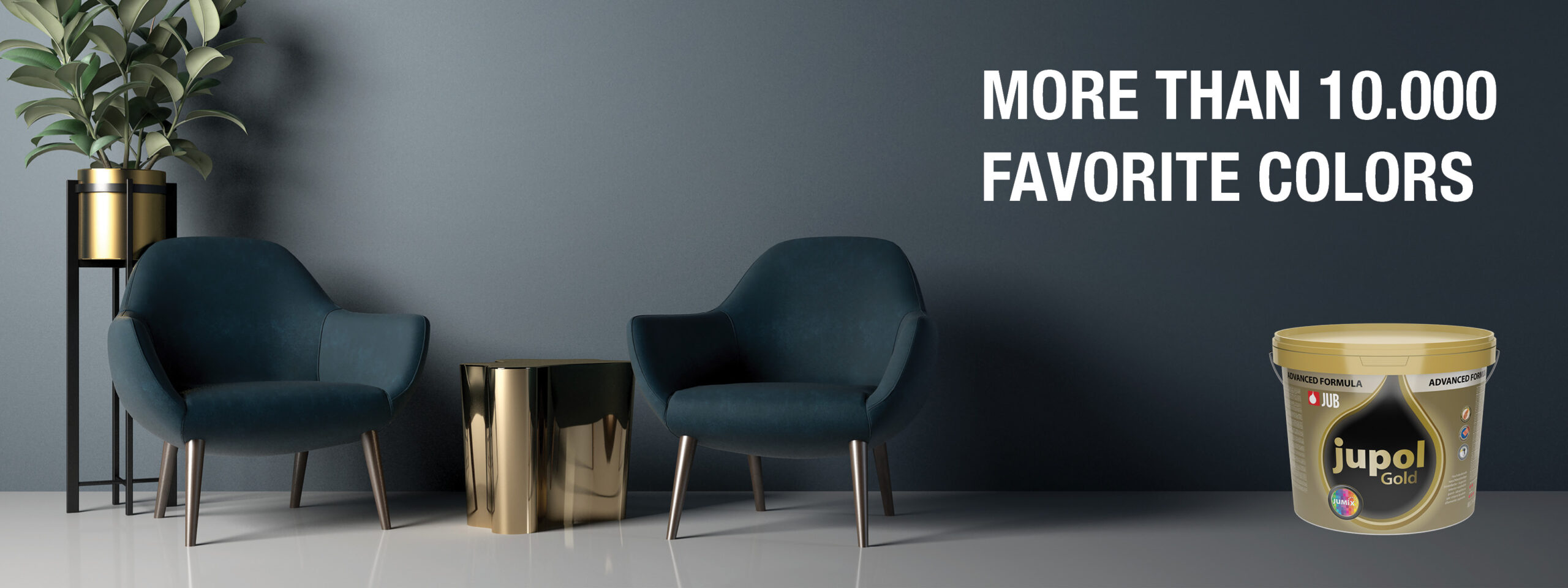
When designing a space, it is usually a matter of combining floor coverings, furniture, textiles and accessories, and all these elements have their own colour tone. Compared to furniture, which is available on the market in limited colour versions, the walls allow by far the most freedom in choosing the perfect colour shade. JUPOL Gold interior wall paint is available in more than 10,000 colour shades and you will surely find the most suitable one for your ambience! The shades cover the entire spectrum of the colour wheel, they also vary in chromaticity, and tinting is possible according to the JUB Favorite feelings colour chart, RAL and NCS colour scales, and also with DIPI concentrates.
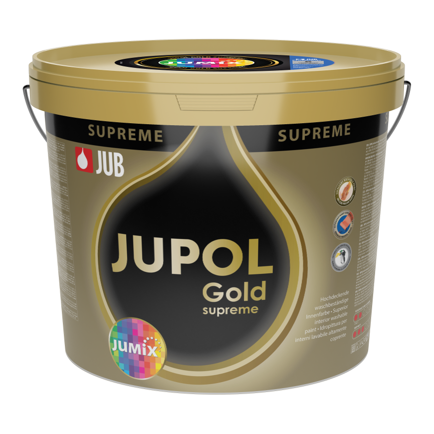
JUPOL Gold supreme
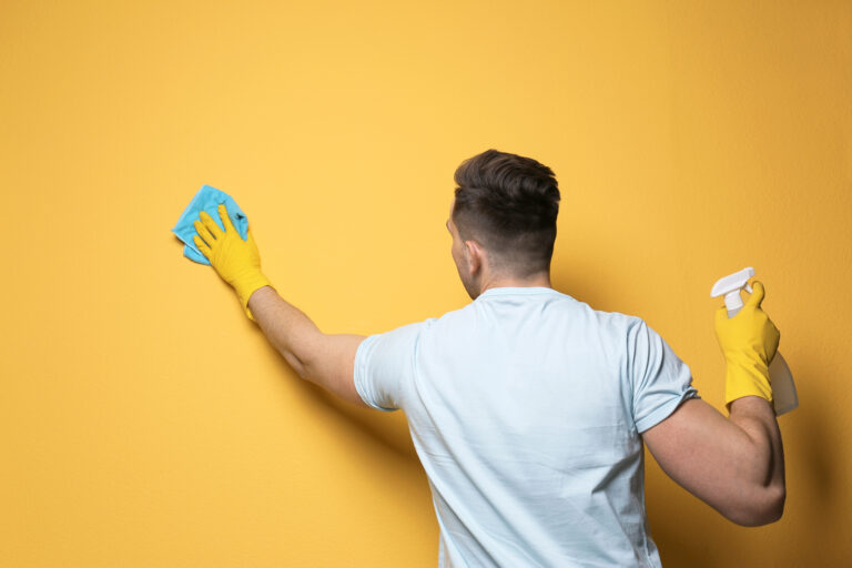
High coverage interior washable paint
For increasingly busy interior spaces, where a premium aesthetic appearance of the repainted surface is also required.