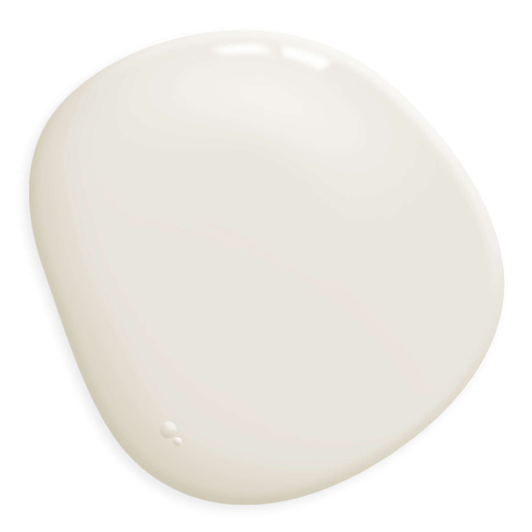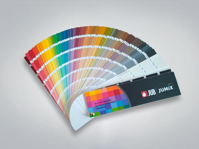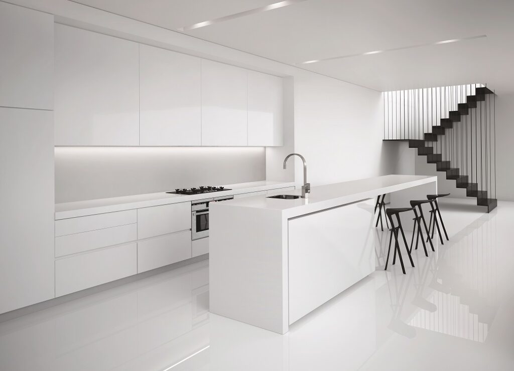
White
White colour symbolizes purity, sterility, and innocence. It illuminates the living space and gives it a feeling of spaciousness. It is the most frequently used colour, as it creates a sense of airiness. Excessive use of white can appear sterile, clinical, and cold. White colour is suitable for all rooms, but it is recommended to combine it with other colours.
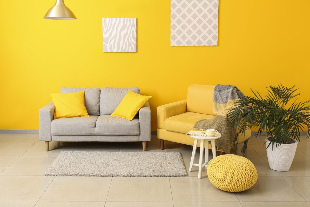
Yellow
Yellow colour symbolizes the sun, joy and warmth, so it is great for reviving and brightening rooms. It creates a feeling of optimism and positivity in the ambience. It can make us happy and give us energy. The colour yellow stimulates metabolism, so it makes sense to use it in the kitchen or dining room, as well as in the living room, as it promotes relaxation and interaction. Yellow is a very strong colour, so it should not be used on all walls, but rather to paint smaller sections. However, if we want to use it on larger surfaces, choose a lighter shade.
Orange
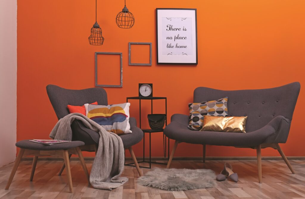
Orange is the colour of creative energy, which evokes a feeling of excitement and warmth in a person. In the kitchen, dining room or living room, the orange colour brings a warm atmosphere, while in more calm, earthy shades it is also suitable for the bedroom. When furnishing a home, we often choose darker shades, burnt or copper, which look attractive and rich.
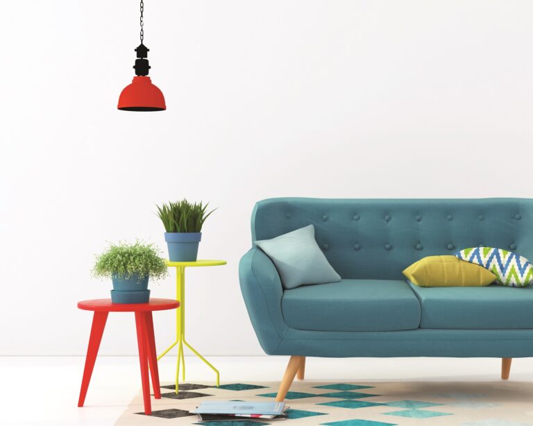
Red
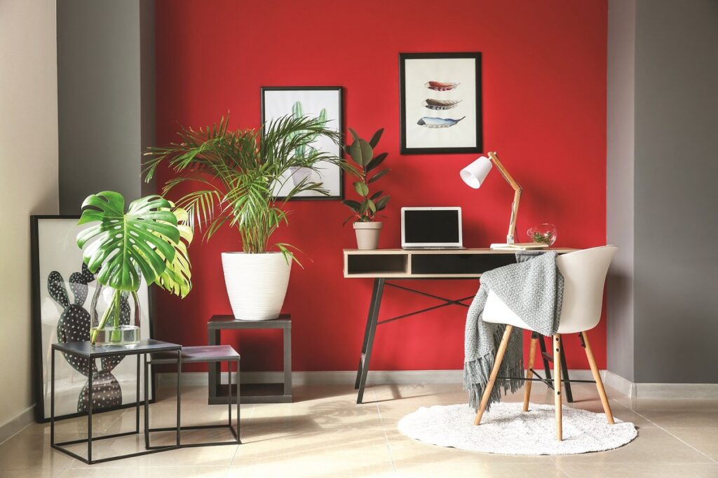
Red is the colour of extremes – passion, love, danger, and anger. Red is an energetic, dynamic, and heroic colour, but it can also give the impression of aggressiveness and contentiousness. In a home, red is the most suitable colour for kitchens and dining rooms, as it encourages liveliness and interaction and the desire for food. If we use it near the entrance door or in the hall, we use it to express welcome. We choose a bedroom in red shades if we want to add passion into the room.
Pink
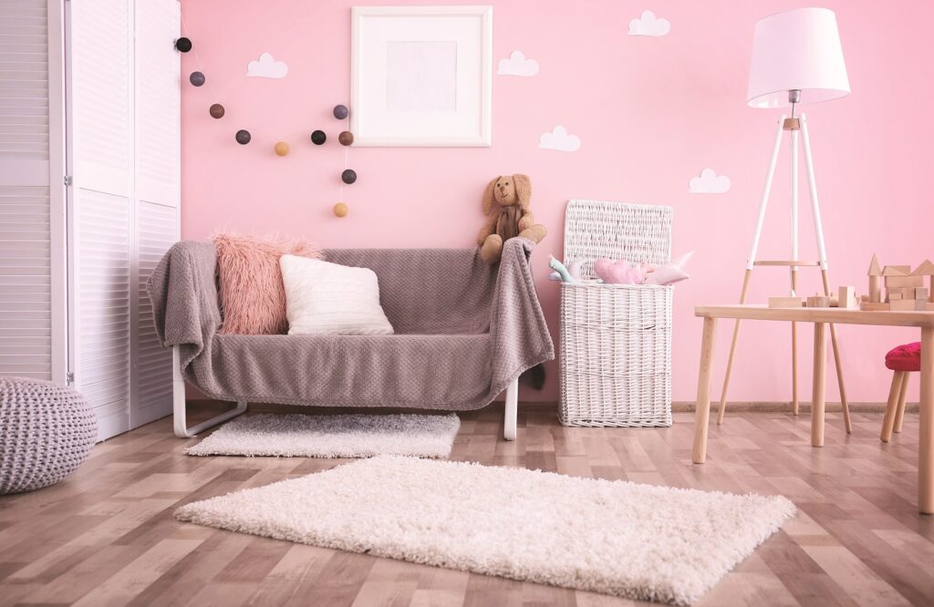
Light pink symbolizes femininity, tenderness, and motherhood. Stronger shades of pink, containing more red, symbolize passion and confidence. Soft shades of pink are popular and calming shades and are suitable for almost any room. Soft pink shades must be a part of girls’ rooms.
Purple
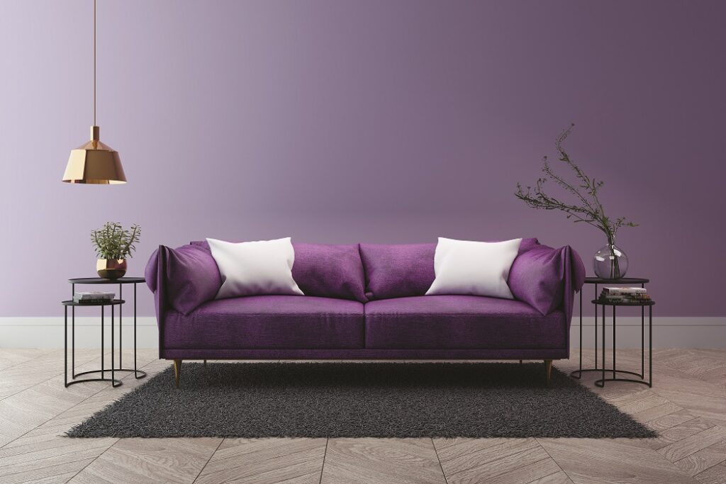
Purple is the colour of luxury, power, magic, and spirituality. Red violet shades in the room give a feeling of warmth, while blue violets have a cooler effect. Since purple also gives a sense of spirituality and calmness, it can be used in rooms for relaxation, meditation and in the bedroom, but only in softer shades. Purple is also suitable for accessories and small areas, as it brings calmness and mental balance, and in smaller quantities it is suitable for creative environments.
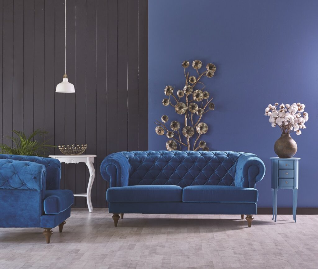
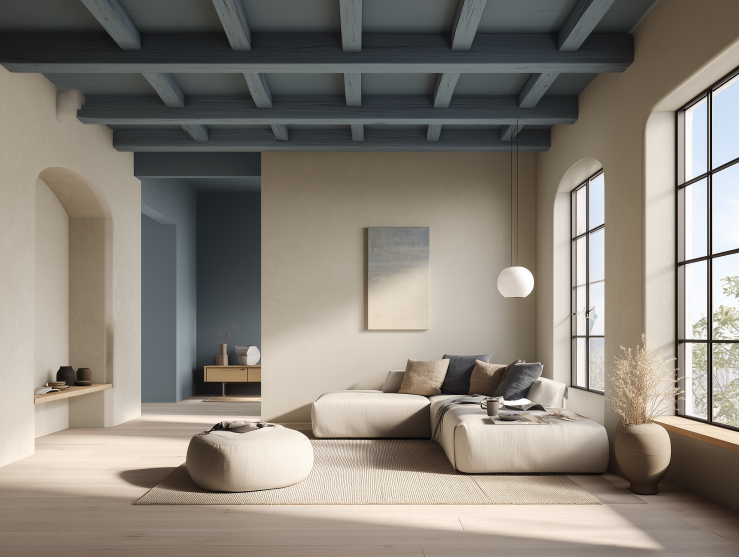
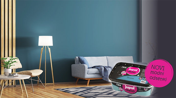
Blue
The blue colour represents the water element, clarity, purity, renewal, and calmness, so it is suitable for walls in rooms where we learn, come up with new ideas or plan the future. It is also perfect for bathroom environments. We choose soft shades of blue for the children’s room if we want to create a space that should be calm and airy. Blue encourages communication, so it is an ideal choice for common areas.
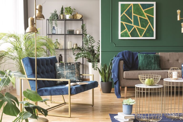
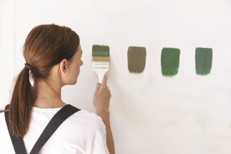
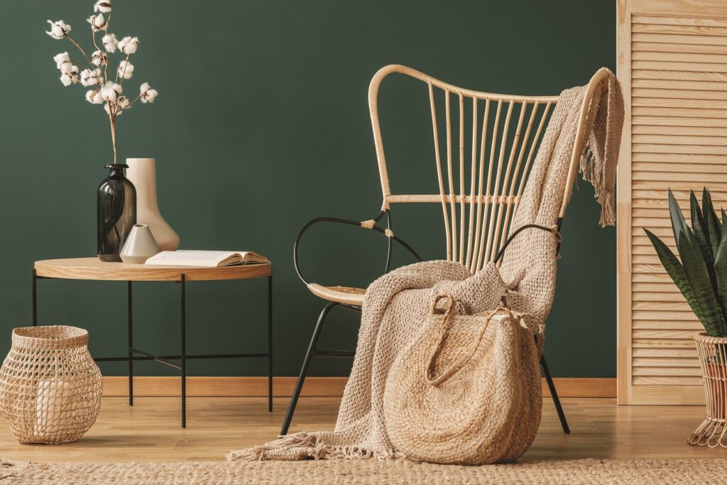
Green
Green tones represent freshness and nature, growth, health, happiness, youth, and fertility. This colour soothes, promotes the healing process, and seemingly rejuvenates any living space. Light green is a fresh and professional colour, while darker shades of green look relaxed and sporty, even trendy. Green can be used in any room, but it is most suitable for living rooms, bedrooms and work spaces.
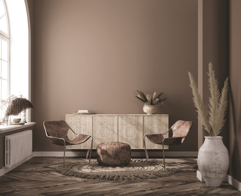
Brown
Brown is the colour associated with earth. It is reliable, insightful, and trustworthy. It’s warm and earthy, but it can also be boring at the same time. The colour symbolizes down-to-earth character, authenticity, strength, and reliability. It gives us a sense of coziness, comfort and convenience, so we can use it in the living room or dining room.
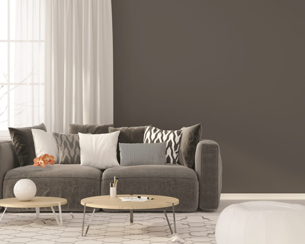
Grey
Gray is the “new white”. Gray symbolizes calmness, dignity, and authority. Due to its neutrality, it fits perfectly into any living space. If we decide to use a darker shade of grey, let’s paint only one wall with it, while a lighter shade can be used on all walls. Light grey looks fresh, modern, it brightens the room and perfectly complements other colours.
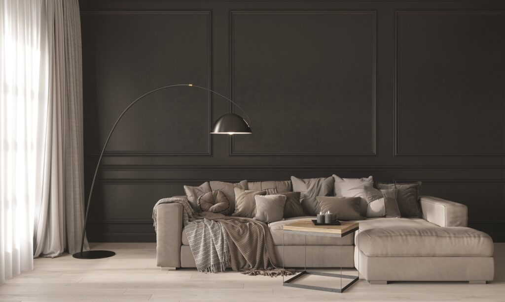
Black
Black is a magical colour that works extremely elegantly when used correctly. In moderate quantities and interesting neutral combinations, it appears cosmopolitan and luxurious. If there is too much black, it darkens the room and creates a gloomy and suffocating atmosphere. That is why designers recommend brightening up black walls with bright accessories and wood.