A related colour scheme includes three colours located next to each other on the colour wheel. Two shades are the basic colours, and the third one is a mixture of them.
Balancing all three shades
To create a sense of balance in the space we furnish, we must balance all three shades by determining their roles and proportions.
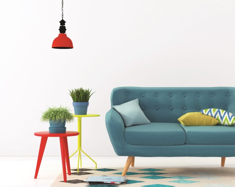
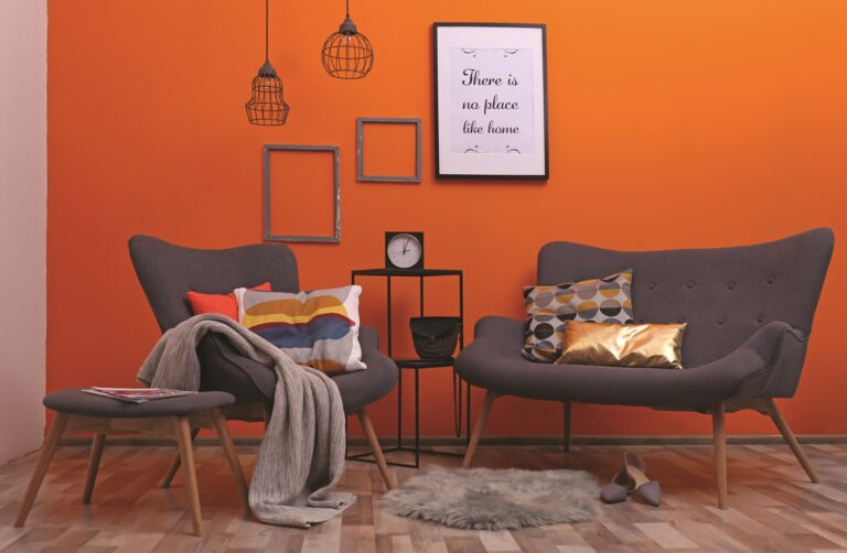
We can use the 60-30-10 rule. First, we choose the main colour that will dominate the room and another colour that will complement it. We will use the last colour only for accents.
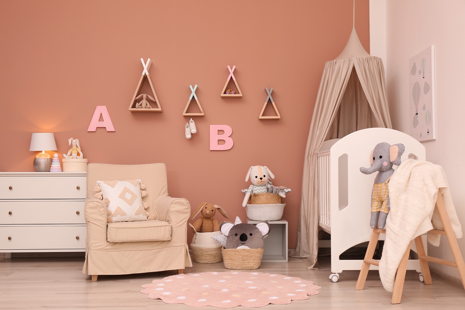
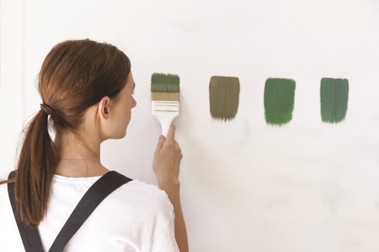
When deciding on a colour scheme with three different colour shades, the oversaturation of the space can happen. Therefore, we do not recommend using very intense shades, but prefer their calmer versions.
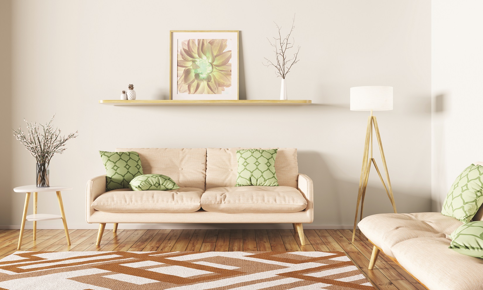
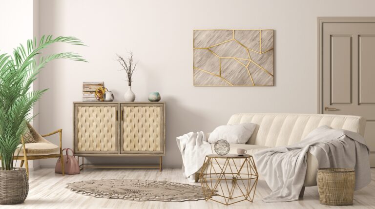
By adding neutral tones to the base colours, we can provide a more subdued colour scheme.
We can do this by adding:
- white – we lighten the shade;
- black – we darken the shade;
- grey – the shade becomes less intense or clean
The same effect can be achieved by adding neutral elements to the room: white wall, white furniture, black carpet, grey fabric, and so on. All this helps us balance the design, while the colours stand out nicely and add vibrancy to the room.